Graphing Interface
CeleryManagement includes several utilities included in the web interface that allow you to easily manage tasks and workers, as well as visualize data associated with your tasks and workers through an included charting interface.
Charting
Query Panel
Presentation of information while using CeleryManagement is important. This is why a simple interface is included that allows you to query the system and quickly view the data that you requested.
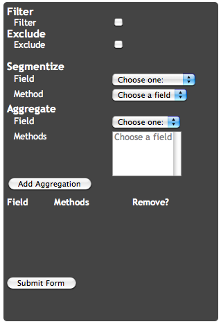
The CeleryManagement query panel
The query panel included with CeleryManagement allows you to filter, exclude, segment, and aggregate your data in multiple ways. The main portions of the panel are the segmentize and aggregate options.
Segmentation
You can segment your data across the x-axis by various fields, including:
- Enumerated Data
- Task name
- State
- Worker
- Time data
- Run time
- Wait time
- Total time
- Sent time
- Received time
- Start time
- Success time
- Failed time
Each field also has associated methods. Some methods do not apply to certain fields, but there are four total fields:
- Each
- Range
- Value
- All
The ‘range’ and ‘each’ fields correspond with time data while the ‘each’, ‘value’, and ‘all’ fields correspond with enumerated data.
Aggregation
Aggregation is similar to segmentation in that it also has methods and corresponding fields to choose from. You aggregate your data across the y-axis by various fields, including:
- Count
- Task name
- State
- Worker
- Run time
- Wait time
- Total time
Each field also has its associated methods and some methods do not apply to certain fields, as it is with Segmentation. The fields include:
- Count
- Enumerate
- Average
- Min
- Max
- Sum
- Variance
‘Count’ corresponds to the ‘count’ method. ‘Enumerate’ corresponds to enumerated data: ‘task name’, ‘state’, and ‘worker.’ Time data, being discrete, allows the fields: ‘average’, ‘min’, ‘max’, ‘sum’, and ‘variance.’
An important distinction when choosing aggregate methods is that a particular field can have multiple methods associated with it at one time.
Examples
You can expect very different output from different queries that are sent to the server. All data that is returned depends on the tasks that have been run, the amount of workers you have executing said tasks, as well as other information.
Below you can see a char of the average, min, and max run times of tasks that were executed on a particular worker. The associated query sent to the server was:
Segmentize
    Field: Worker
    Method: All
Aggregate
    Field: Runtime
    Methods: Average, Min, Max
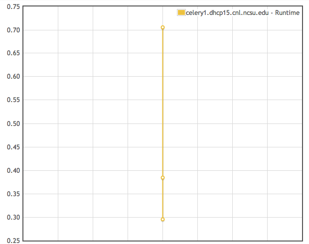
The average, minimum, and maximum runtime for a single worker presented in line graph form
What if you have multiple workers executing tasks? When another worked was activated, the same task was run, and the same query used before was submitted, the data returned what charted below.
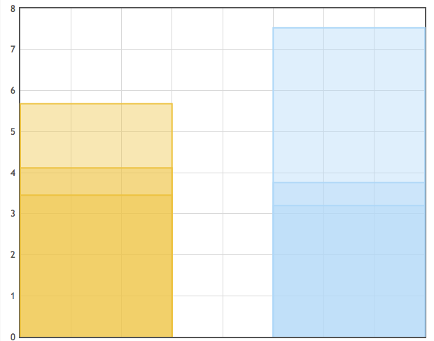
The average, minimum, and maximum runtime for workers presented in a bar graph form
In this chart, the option was set to display data as bar graphs. You can still see the average, min, and max run times of tasks executed on each worker.
Besides working with workers, you can retrieve data related to tasks. For example, running the following query yields a chart of the number of tasks:
Segmentize
    Field: Task Name
    Method: All
Aggregate
    Field: Count
    Methods: Count
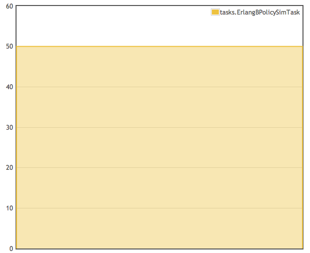
The number of tasks that were executed by all workers
The chart shows that you that 50 ErlangBPolicySimTask were run on the several different workers.
When visualizing large amounts of data, sometimes you have to decided which type of graphs (line or chart) that you wish to use. The chart below shows the total time taken for each task to execute on a given worker. It was generated using:
Segmentize
   Field: Task Name
   Method: Each
Aggregate
   Field: Total Time
   Methods: Average

The total time of each task that was executed presented in bar graph form
As you can see, it seems like there isnt much variation in the data. That is because we are using a bar graph to display time values that are very close. When you switch to a line graph, like below, you can see the variation more clearly.
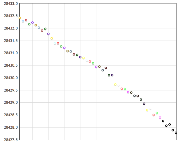
The total time of each task that was executed presented in line graph form
With any data that is charted, you can choose to display through a bar or line graph. It is up to you to decide which form would be the best for your data. Sometimes, all you need is a bar graph and sometimes, like in the previous case, a line graph will show you the small variations in your data. The choice is left up to you.